Next Level Data
Timeline
January 2025 to April 2025
Role
Lead UX Designer
Constraints
Stylization
Short Cycle
Complexity
Worked with a small team of developers to develop and design their sports bingo experience for future publishing. Conducted user research through competitive audits and a small user base, while working to design core mechanics, components, and other design mechanisms to build the foundation for both mobile and desktop applications.
Next Level Data
Worked with a small team of developers to develop and design their sports bingo experience for future publishing. Conducted user research through competitive audits and a small user base, while working to design core mechanics, components, and other design mechanisms to build the foundation for both mobile and desktop applications.
Worked with a small team of developers to develop and design their sports bingo experience for future publishing. Conducted user research through competitive audits and a small user base, while working to design core mechanics, components, and other design mechanisms to build the foundation for both mobile and desktop applications.
Timeline
May 2025 to August 2025
May 2025 to August 2025
Role
UX Designer
UX Designer
Constraints
Time
Content Organization
Small User Pool for Research
Time
Content Organization
Small User Pool for Research
Outcomes
Outcomes
1
Website Prototyped
20+
Frames Implemented
5+
Icons Designed and Implemented
3
Months to Prototype
Months to Prototype
5
New interactions developed
New interactions developed
1
Website Prototyped
Website Prototyped
Design Process
Design Process
Design Process
The Kickoff
The Kickoff
The project that I worked on for Next Level Data was not overly complicated in visual design, but rather the experience. The project demanded a good understanding of dark patterns, and a unique interface unlike anything I had worked on before.
The project that I worked on for Next Level Data was not overly complicated in visual design, but rather the experience. The project demanded a good understanding of dark patterns, and a unique interface unlike anything I had worked on before.
The project that I worked on for Next Level Data was not overly complicated in visual design, but rather the experience. The project demanded a good understanding of dark patterns, and a unique interface unlike anything I had worked on before.


The project demanded a good understanding of dark patterns, and a unique interface unlike anything I had worked on before.


Take Aways
Take Aways
Information Hierarchy
Information Hierarchy
We tackled a unique problem with information overload by creating a split interface for easy access.
We tackled a unique problem with information overload by creating a split interface for easy access.
One of the most important aspects of the project was how we decided to integrate the information into the application itself. Because of the nature of the information we wanted to display, it was extremely easy to overcrowd and overwhelm the user.
One of the most important aspects of the project was how we decided to integrate the information into the application itself. Because of the nature of the information we wanted to display, it was extremely easy to overcrowd and overwhelm the user.

To solve this issue, we thought through multiple solutions. While we thought of separating the bingo board itself on a separate panel, we ultimately decided to try and keep the board easily accessible when selecting what items users wanted to add to the board.
To solve this issue, we thought through multiple solutions. While we thought of separating the bingo board itself on a separate panel, we ultimately decided to try and keep the board easily accessible when selecting what items users wanted to add to the board.
To solve this issue, we thought through multiple solutions. While we thought of separating the bingo board itself on a separate panel, we ultimately decided to try and keep the board easily accessible when selecting what items users wanted to add to the board.
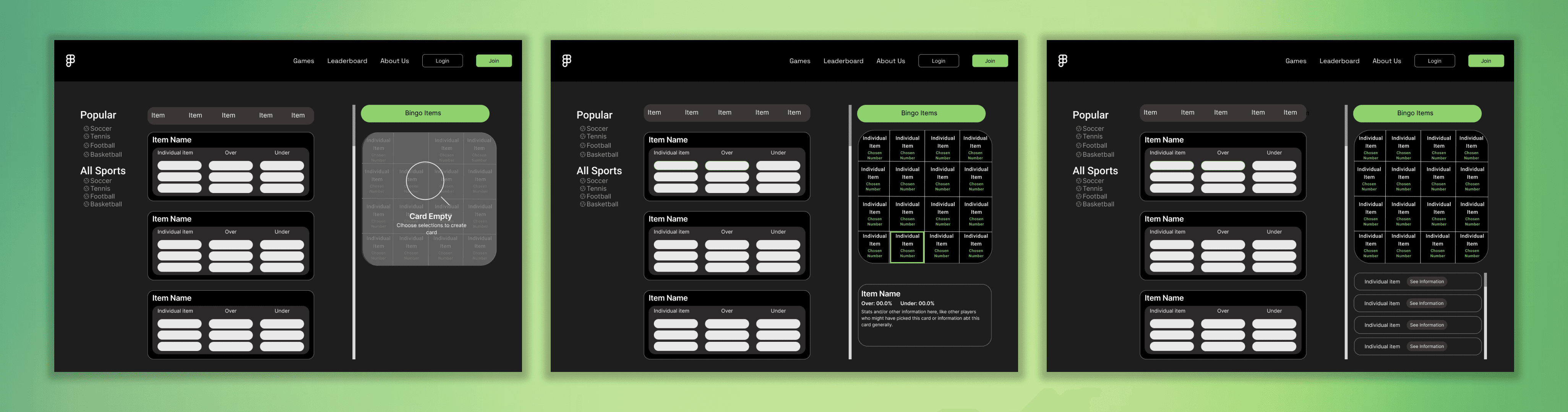

For our desktop model, we used the filters and the scroll bar to create sections of the page, which allow for the options to be sorted and compared with ease. With their card displayed on their right, users could easily view what they already had to plan for what they wanted.
For our desktop model, we used the filters and the scroll bar to create sections of the page, which allow for the options to be sorted and compared with ease. With their card displayed on their right, users could easily view what they already had to plan for what they wanted.


For our mobile model, a split screen made no sense, as it would crowd the users view and make interactions incredibly frustrating. Instead, we created a button prompt that appears when the user selects an option, allowing for easy access to the user’s card and their past selections. This should mimic the easy access on desktop, helping mobile users have the same accessibility.
For our mobile model, a split screen made no sense, as it would crowd the users view and make interactions incredibly frustrating. Instead, we created a button prompt that appears when the user selects an option, allowing for easy access to the user’s card and their past selections. This should mimic the easy access on desktop, helping mobile users have the same accessibility.
Take Aways
Take Aways
Research Diversity
Research Diversity
We creatively worked around a lack of funds and users by using outside research from the industry.
We creatively worked around a lack of funds and users by using outside research from the industry.
As our team was small, we didn’t have access to funds for user testing. Despite this constraint, we wanted to be able to deliver a high quality product that could compete with the other high profile sports applications online, such as Fanduel. With that in mind, we focused on prior research that could teach us more about the industry.
As our team was small, we didn’t have access to funds for user testing. Despite this constraint, we wanted to be able to deliver a high quality product that could compete with the other high profile sports applications online, such as Fanduel. With that in mind, we focused on prior research that could teach us more about the industry.
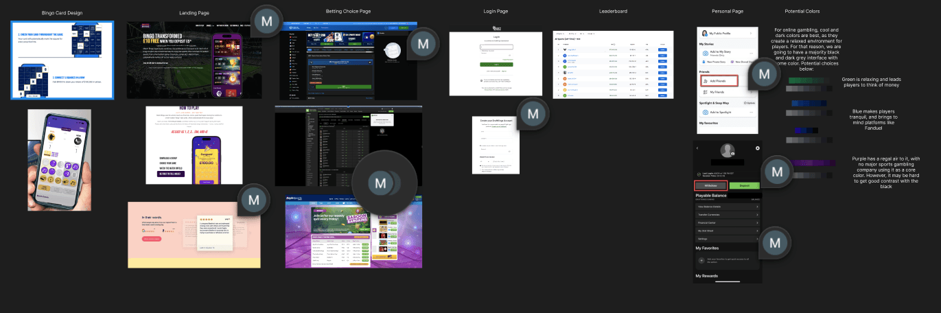

The main form of research that we conducted were Competitive Audits. These audits allowed us to understand key design details, such as use of color, placement of key elements, and functionality, that gave us insights into what users liked and disliked. By understanding what other companies aimed to accomplish, we could tweak those ideas to fit our own, and make up for our lacking user research.
The main form of research that we conducted were Competitive Audits. These audits allowed us to understand key design details, such as use of color, placement of key elements, and functionality, that gave us insights into what users liked and disliked. By understanding what other companies aimed to accomplish, we could tweak those ideas to fit our own, and make up for our lacking user research.
As we were working in sports betting, dark patterns were in the front of our minds. We wanted to make a platform that would be more user friendly, while allowing for the same fun that many find in competitors. As such, we needed to work backwards, and understand the dark patterns that other applications might have used to get users hooked, and make sure to keep them out of our own application.
As we were working in sports betting, dark patterns were in the front of our minds. We wanted to make a platform that would be more user friendly, while allowing for the same fun that many find in competitors. As such, we needed to work backwards, and understand the dark patterns that other applications might have used to get users hooked, and make sure to keep them out of our own application.